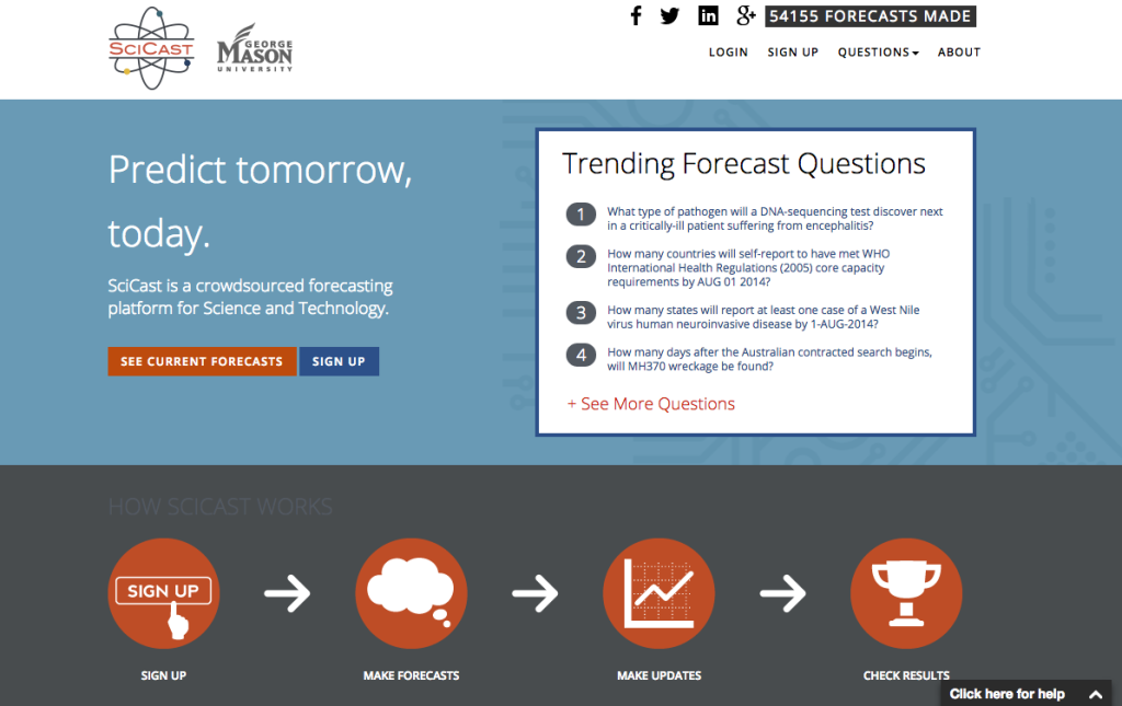
As of tonight, SciCast is sporting a slick new look.
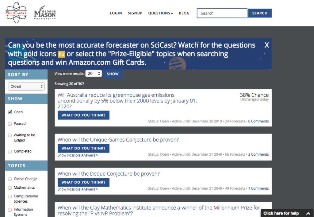
 In addition to the new color palette, here’s what the list of questions looks like:

And the individual question view with Trends & History graph data:
Check it out for yourself this evening and let us know what you think!
Users who have LIKED this post:


I like everything except the leaderboard, which now takes up too much space to display the same information that was previously displayed more compactly. Specifically, there seem to be unnecessary line breaks between rank, @username, and score within each leaderboard entry. Should be easy to fix, if others agree with me.